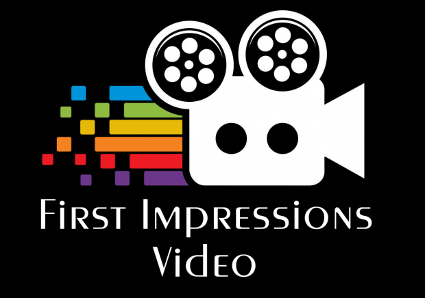
Ahhh…Spring isn’t far away! In fact, we just shifted to Daylight Savings Time* this past weekend. And with Spring, it’s often time to freshen things up. When I started First Impressions Video, I used a graphic image as the company logo that was OK at the beginning, but in need of upgrading for better application in print, online, photos, wearing apparel, and, of course, video. With that in mind, I am pleased to introduce the new logo for First Impressions Video!
The designer provided me with three distinct looks and an additional set with fully transparent backgrounds to further extend the use into video and photography. I am pleased with his work and even my apparel embroiderer gave the new look a “thumbs up.”
I will be applying the new logo over the next few weeks, so watch for the change!
*Note: For my grammar conscious friends who would be quick to correct my reference to ‘daylight savings time,’ I have accepted the more commonly used term, though the proper spelling is to not use the second “s” in the word ‘savings.’


Great New Logo, Terry!
My first impressions are … 1) wonderful, progressive use of colors, squares, lines and circles (movement from left to right), 2) the two holes (aka eyes) in the camera “draw you in” (asking you to put yourself in the picture), and, 3) the two film-spools, top of camera, make me think of “Mickey Mouse Ears”. (Are you working with Disney? Ha ha)
Good Luck with the Great New Logo & First Impressions Video, Terry! (“Luck is 99% what you make it.”) First Impressions are never forgotten!! Have a great day! Bob
Well geez, Bob…that’s about as incredible a comment as I’ve heard in quite a while! And thanks, too! Your observations and analysis are spot-on…all but the Disney part, though I did a LOT of stuff with Disney back in my airline/cruise line days! Very thoughtful comments, Bob, thanks again!